Each year since 2007 PR Week creates and posts a “Power List” of the most powerful and influential people in PR. From 2007 to 2010 the list topped at 25. From 2011 to present the list has expanded to include 50.
If you gather up the lists and look at the individuals chronologically from 2007 through to 2015 the results resemble the board game “Chutes and Ladders.” I specifically wanted to see how the 2007 winners fared throughout the years, and then wanted to see how the current batch of winners wound their way to their current positions. The below is a back-of-the-napkin, data-visualization analysis.
Here’s a quick guide to read the images…
- Grey lines represent a continuous position on the list from year to year
- A black line means that person laddered-up to the top position
- A red line means that person exited the list after their position
- An orange dotted line means the person was off the list for this period of time, but returned
- A green dotted line means the person handed-off their position to a new/different person at their company (As example, in 2013 Harris Diamond passed the Weber Shandwick baton to Andy Polansky, and Leslie Dach handed the Wal-Mart baton to Dan Bartlett)
- An “X” next to a name means they were one-time listees
2007 Power Listees and their Trajectory:
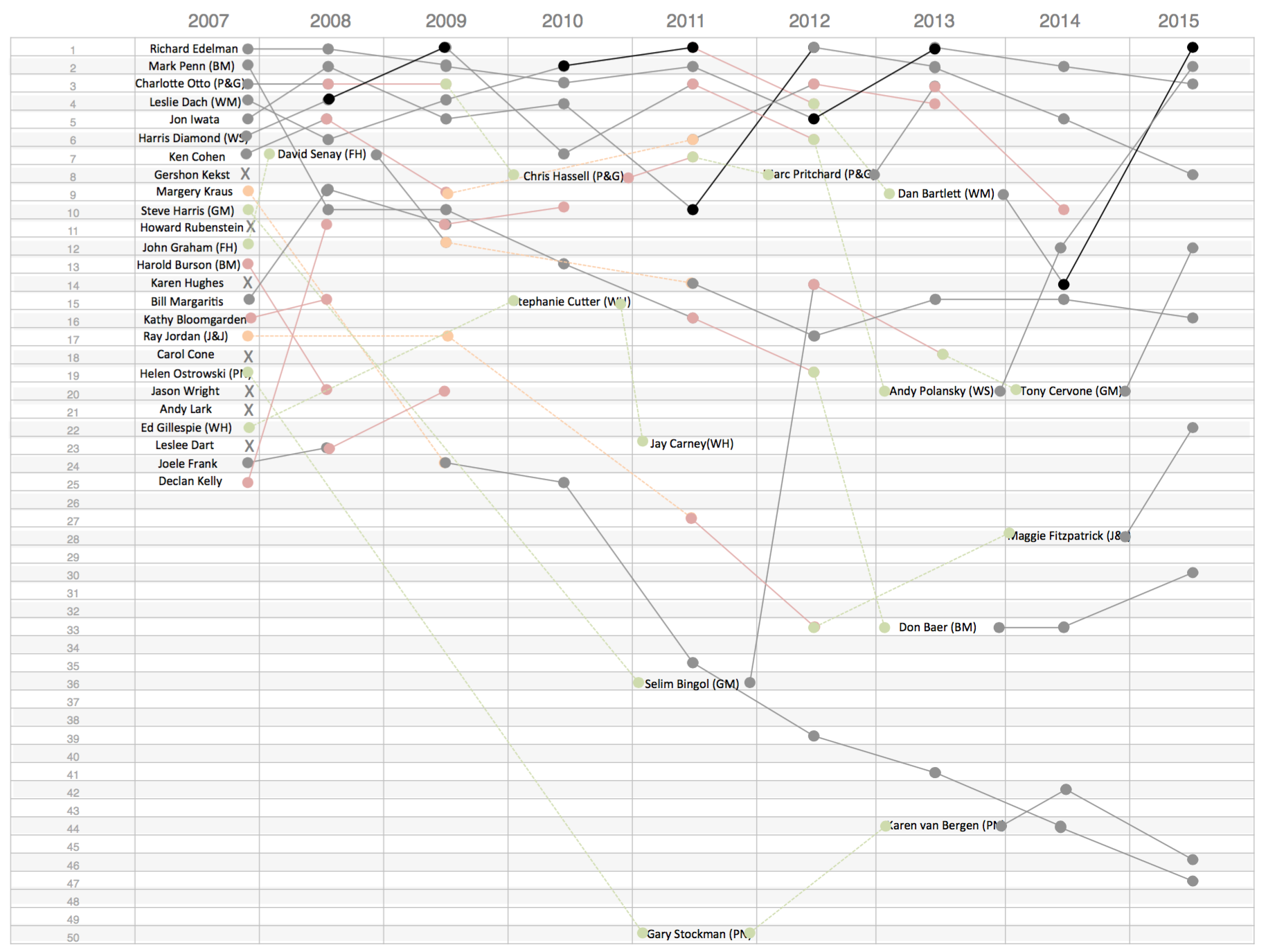
More individuals seem to “chute” than to “ladder,” potentially due to the expansion of the list in 2011. What’s also visible is the bunching of the top leaders. Most of the top leaders maintained a position within the top 10 year-over-year until 2013, when some of their replacements took over the roles. Though many of the replacements trended back up.
2015 Listees and their Paths to Glory
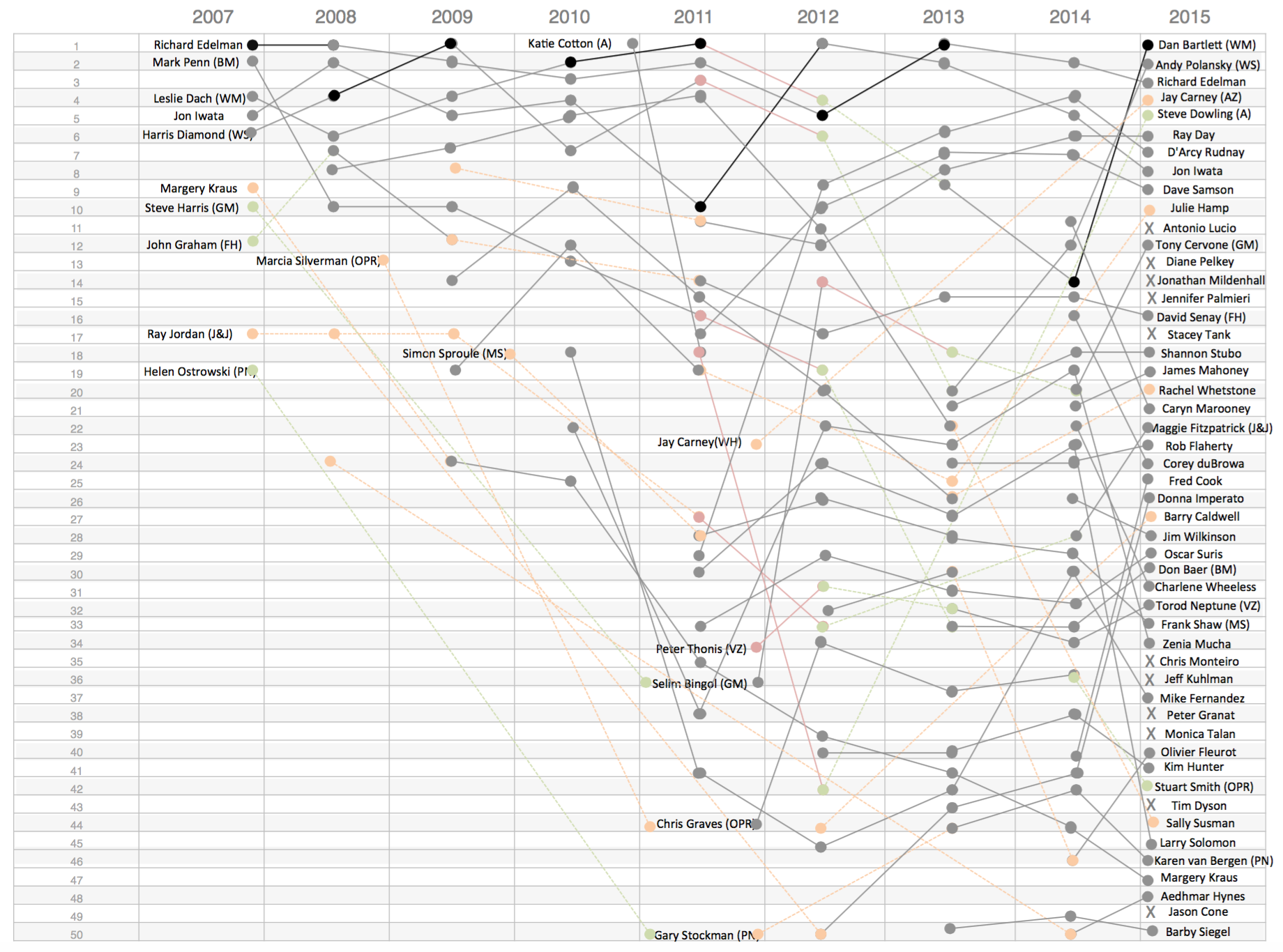
A different story appears through this data-visualization, though some of the principles remain. One key remaining principle is the top people on the Power List tend to remain at the top. You can see that a new wave of individuals emerge in 2012 and incrementally ladder their way to the top 10. The dramatic churn of individuals between 2010 and 2012 is also apparent, with a few years of list stability until this year, then there is a new wave of disruption in the list. Still, this new disruption is more of a changing of seats than people dropping from the list. Many of the people from 2014 remain on the list in 2015.
Areas of high drama in this visualization include:
- The ascension of Dan Bartlett to the top position
- The descent of Katie Cotton, the handoff to Steve Dowling, who retakes a top spot
- The rebound of Rachel Whetstone
- The rebound of Donna Imperato
- The descent of Margery Kraus from top 10 to bottom 5
There’s a lot more than can be derived from this data, such as the impression that women fare worse then men, and that strong brands hold their positions even through leadership changes (Wal-Mart, P&G, Fleishman-Hilliard). The above was my first take on this data.
Notes:
- I once worked for a venture capital group that owned the celebrity index Popex. I wonder if a tool/game like that would be a valuable add-on to this list.
- I captured the above data points within excel, then used PowerPoint to create the images.